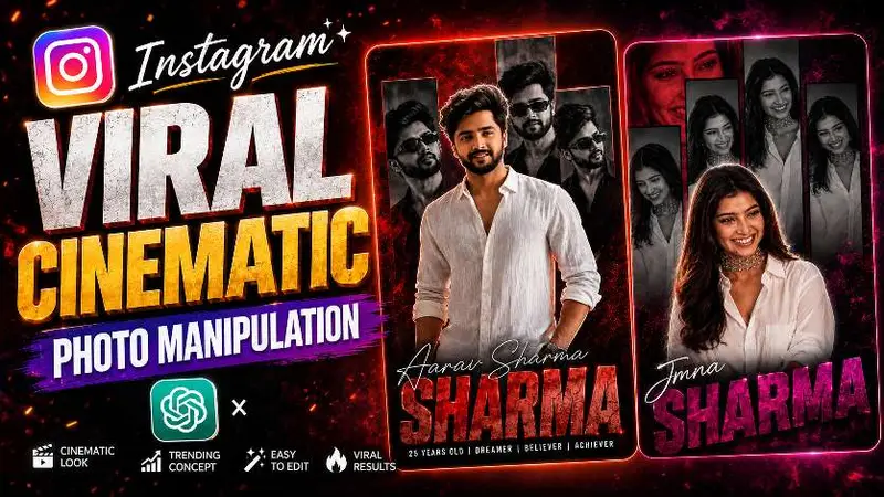
Instagram Viral Cinematic Photo Manipulation — ChatGPT Viral Prompt Photo Editing
Cinematic photo manipulation turns a normal portrait into a poster-grade image: controlled rim light, a readable silhouette, typography that supports the face instead of covering it, and color separation that still survives Instagram’s compression. The viral versions you see in feeds are rarely one click; they are a short pipeline with clear responsibilities at each step.
Why the trend reads as “premium”
Premium cinematic edits share three traits: a believable environment cube (even if stylized), specular behavior that matches the stated light source, and a hierarchy where eyes and mouth lead the scan path. When any one of those drifts, viewers sense “filter” instead of “poster.” Your prompts should therefore ban stock phrases like “8k hyperreal” and replace them with measurable instructions about falloff, grain, and bokeh shape.
Two-pass workflow: structure, then drama
Pass one establishes geometry and identity: pose, wardrobe continuity, and background depth. Pass two adds drama: localized glow, rain or haze, title lockup, and film grain. If you merge passes, models often bake glow into skin midtones and you lose recoverable detail. Keep a layered mindset even if your tool exports a single JPEG at the end.
Copy-ready ChatGPT prompt pair
Typography that survives a phone screen
Viral poster edits fail when type fights the jawline. Ask for a title lockup that obeys a margin band and uses weight contrast instead of outline stacks. If you need secondary language, tuck it into a subline with lower contrast rather than duplicating size.
QC checklist before posting
- Skin texture still present at nostril and cheek—not airbrushed into plastic.
- Earring highlights match the key light direction.
- Background blur has plausible circles, not watercolor smear.
- Text legible at thumbnail scale; no moire on fabric patterns.